Get the Best of Data Leadership
Stay Informed
Get Data Insights Delivered
If you’ve made the investment in data observability, the next challenge is figuring out how to measure whether it’s actually working. On paper, this seems simple—detect issues before they reach your business users, and your investment pays off. But in practice, the better your system becomes at keeping problems from reaching those users, the less visible the impact of your data observability efforts. Ironically, a perfectly functioning data observability platform can make it seem like you don’t need one at all because nothing ever seems to go wrong.
So, how do you measure and share the return on investment (ROI) of your data observability platform?
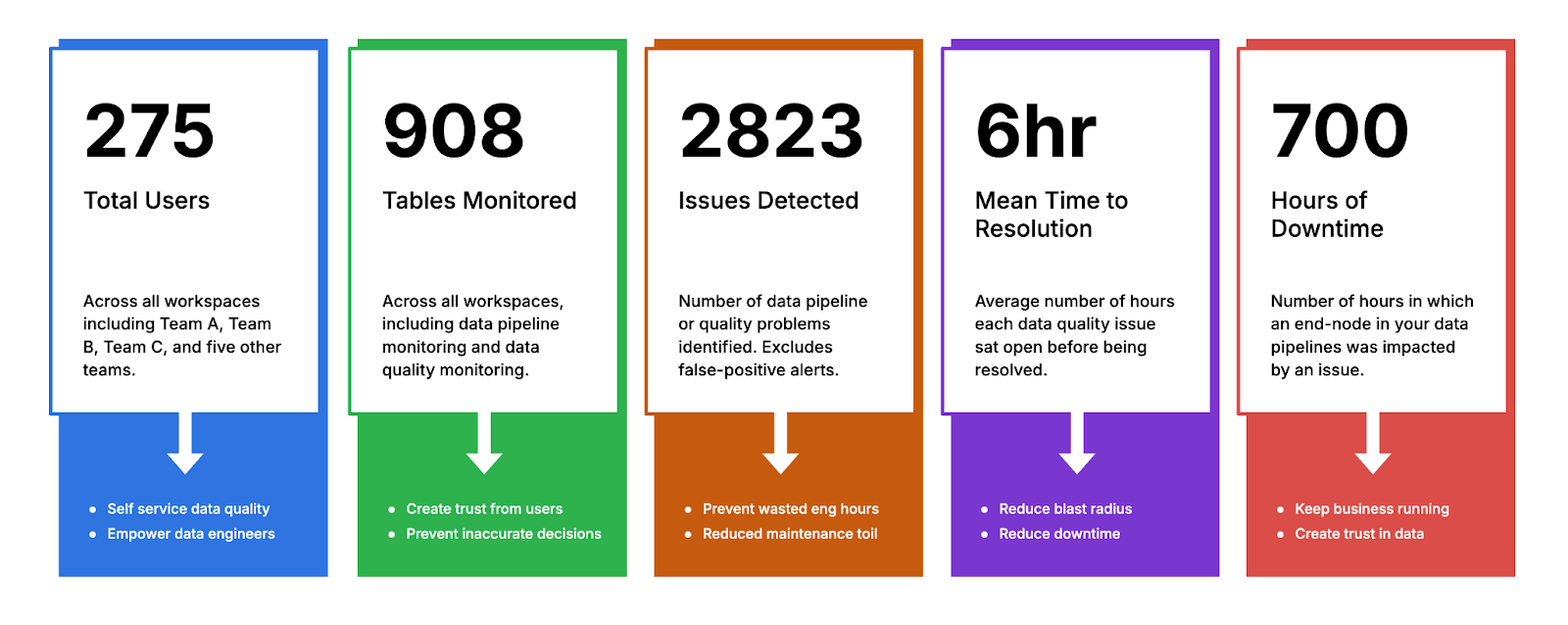
We’ve worked with hundreds of enterprise data teams and have identified five key metrics that help show whether your deployment is actually making a difference. These metrics provide both hard data and a clear story to tell your stakeholders.
Let’s break them down.
The Metrics:
Weekly Active Users

Your first indicator that your data observability platform is working should be usage.
The more people regularly logging in to monitor, troubleshoot, and act on data issues, the more it’s integrated into your team’s workflow. Weekly Active Users (WAUs) provide a simple but effective measure of engagement.
A higher WAU count shows that your team is actively leveraging the platform, rather than letting potential data quality issues slip by unnoticed. However, it’s not just about quantity. Make sure to break down who is logging in—are they the right people? Are your data engineers and analysts making the most of the tools at their disposal, or are the people who could benefit most sitting on the sidelines?
Beyond your internal team, it’s also worth looking at any third-party usage if your observability platform integrates with partners, contractors, or external systems.
Coverage

Coverage measures how much of your data estate is being monitored. It’s one thing to have a powerful data observability platform, but if it’s only watching over a fraction of your tables and columns, you’re leaving massive blind spots.
Coverage can be broken down into two sub-metrics:
- Percentage of tables and columns covered: What percentage of your data assets have active observability on them? Ideally, this number should approach 100%.
- Raw number of tables/columns monitored: As your company grows and adds more data sources, this number should increase in lockstep.
More coverage equals more confidence that potential data quality issues are being caught before they snowball into larger business problems. It’s important to track how this grows over time. If you had only 50% coverage six months ago but now you’re up to 85%, that’s clear progress you can report on.
Number of Issue Detections (and Ratio to User-Reported Issues)

The third key metric is the number of issues your data observability platform detects. This number, on its own, gives insight into how active and effective your system is at catching problems before they impact users.
But here’s where it gets more interesting—compare this number to the number of issues reported by users. Ideally, your platform should catch the vast majority of data quality problems. If you find that business users are still the ones surfacing issues, your data observability platform is not doing its job.
A healthy ratio might look something like this: for every 10 issues your platform catches, users report only one. This shows that the platform is doing its job—keeping bad data from reaching decision-makers.
Mean Time to Resolution (MTTR)

Catching issues is step one, but how long does it take your team to fix them once detected? This is where Mean Time to Resolution (MTTR) comes in. MTTR measures the average time it takes to resolve a data quality issue, from the moment it’s detected to when it’s fixed.
In a perfect world, your MTTR should be continuously improving as your team gets more comfortable with the platform and more efficient at resolving problems. A fast MTTR minimizes the impact of data quality issues, keeping your business operations running smoothly.
Track your MTTR over time and against benchmarks. If it’s taking longer to resolve issues than it did six months ago, that’s a red flag. But if you’ve shaved significant time off your MTTR, that’s a powerful metric to share with leadership.
Downtime Hours

Finally, let’s talk about downtime. For many businesses, data downtime can be just as crippling as an outage in a critical service. Downtime hours measure how long data quality issues affect your business before they are resolved.
If your platform is doing its job, you should see a steady decrease in downtime hours over time. More importantly, if you can show a direct correlation between improved data observability and reduced downtime, you’re making a clear case for the value of your investment.
It’s worth noting that downtime hours don’t just refer to complete system outages. Any period where poor data quality is preventing users from accessing accurate, reliable data counts as downtime.
Your Vendor Should Be Helping You Measure This
If you’re not able to easily access these metrics through your data observability platform, that’s a problem.
Your vendor should provide these numbers, either through the platform itself or as part of regular support and reporting. If you’re not getting this data today, it’s time to ask your vendor why not.
Telling the ROI Story
Now that you have the metrics, how do you use them to show ROI?
Start by comparing these numbers to prior quarters or a year ago.
Are your active users increasing? Is your coverage improving? Are you detecting more issues before they reach users? Are you fixing problems faster, and are your downtime minutes decreasing?
These comparisons help tell a clear story to your leadership: the investment in data observability is driving tangible improvements in how your business operates.
Lastly, remind your leaders that data quality issues are often invisible by design. The less they hear about problems with data, the more effective your team has been in preventing issues that slow down the business. In a sense, the absence of complaints is a signal that the system is working.
With these five metrics and a strong narrative, you’ll be well-positioned to demonstrate the real, measurable value of your data observability platform.
Ready to see a personalized walkthrough of Bigeye? Request a demo here.
Monitoring
Schema change detection
Lineage monitoring




.png)
.png)
